Industry Insights
Pop Marketing Quiz
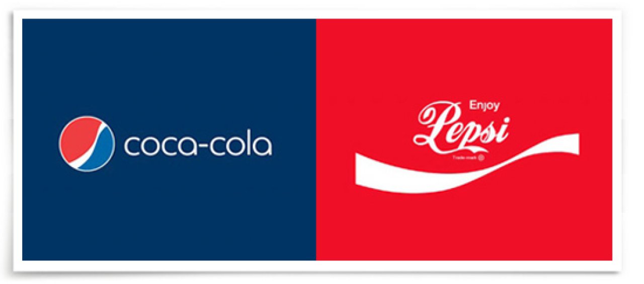
I came across a clever info graphic the other day that compared the logos of Pepsi and Coca-Cola. On one side, it shows the Pepsi logo undergoing sometimes subtle, sometimes dramatic changes as the decades go by, contrasted by Coke’s familiar red decorative script that has remained largely unchanged*. Now, don’t let the graphic fool you – both companies are constantly trying to out-innovate the other with how they market their product, but it’s worth noticing the difference in strategies of two market leaders as they try to sell what is essentially the same product. *It should also be noted that the graphic is omitting the fact that Coke has had a few missteps along the way (New Coke, anyone?).
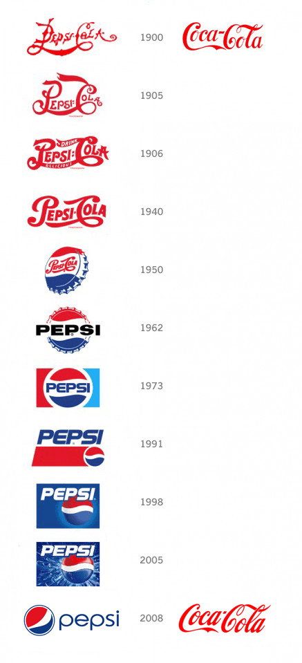
What we’re seeing is two different strategies at work – two different stories being told. Pepsi wants to be “the choice of the new generation”. They use language like “Refresh Everything”. “Generation Next”. “Be Young, Have Fun, Drink Pepsi”. To Pepsi, change is good. They are constantly evolving their identity. As new trends come along, Pepsi is quick to jump on. Looking at the Pepsi timeline is a crash-course in graphic design trends for the past 100 years. From the old-fashioned scriptive type, to bold sans-serif, to aggressive italicized fonts to gradient, glowing, embossed orbs, finally to a friendly, modern lower-case word mark. All were cutting edge at their time, but all have come and gone with the latest trends.
Coke, on the other hand, wants to be seen as “Classic” and even a bit nostalgic with their never-changing logo. They use language that enforces the idea – “Always Coca-Cola”. “The Real Thing”. “Have a Coke and a Smile”. As trends come and go, their calligraphic time capsule of a logo is a reminder that you can enjoy a Coke just like you did when you were a kid and it will be every bit as refreshing.
So now for a pop quiz – who’s strategy is right? Pepsi’s or Coke’s? Well, in this case, they both are because the way they look is aligning with the way they talk about themselves. What can we learn from this quick case study? It’s a reminder to take a good hard look at your own business. Ask, “does the way I talk about my business line up with the way my business looks to my customers? This question can unearth some inconsistencies in your brand. Are you trying to market yourself as a luxury homebuilder, but your business card was printed at home while your printer’s ink cartridge was low? Don’t pretend your customer won’t notice. Is your branding a little too macho when your primary audience is the design savvy woman of the house looking for a modern outdoor kitchen? You need to speak her language.
Are you concerned that the way your business looks and the way it sounds aren’t lining up? Take your brand up a notch and do the hard work of asking these tough questions. It will make a big difference.

Written by Joel Reynolds
January 14, 2013