Industry Insights
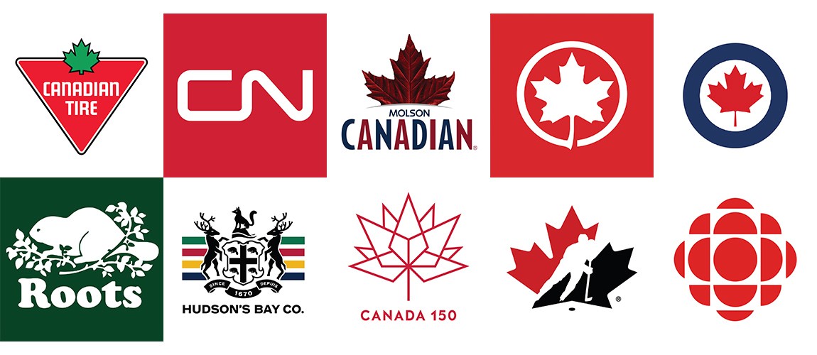
Canada 150: Our Favourite Brand Identities
Canada continues to have a humble — yet profound — impact in the graphic arts world. To celebrate Canada's 150th birthday, each day a member of our team will be sharing a little bit about their favourite Canadian brand or identities.
The Canadian Flag

There really is no other flag in the world quite as beautiful as ours. Not only is it a well conceived design (the number and arrangement of the points of the leaf were chosen only after wind tunnel tests showed the current design to be the least blurry when tested under high wind conditions), it has also become a recognizable and winsome symbol around the world representing our Canadian values and culture.
The Canadian flag was introduced back in 1964 by Prime Minister Lester B. Pearson to replace the Union Jack. As with all good design it was not approved without a serious debate. But in the end the maple leaf design by George Stanley, based on the flag of the Royal Military College of Canada, was selected. It’s a fine example of Canadian graphic design. Bold, beautiful, unique, legible, easy to reproduce and easily worn or flown with pride.
Diego
My life in Canada began in 2000 when my family left Mexico City and moved to Toronto. As our plane touched the ground, I remember looking out the window and seeing dozens of planes boasting the maple leaf livery. As a young airline enthusiast, I became obsessed with Air Canada and its logo.
One of the things that still speaks to me about that logo is its timeless authority. While designed in 1965, it has only seen a slight update. In our minds, a circle stemming out of a maple leaf is and always should be “Air Canada.”
Designers often feel the need to over-complicate concepts to justify their price, but Picasso reminds us that “[Design] is the elimination of the unnecessary.”
Achieving meaning through simplicity is no small feat. It requires discipline, discernment, and talent. It involves exploring all plausible options and choosing a single one.
Hans Kleefeld chose right.
Ryan

For better or for worse, the CBC has been an integral part of the fabric of Canada since it’s inception in 1941 – as a radio broadcaster with the first TV stations being added in 1952.
But for me, reminiscing about the CBC is less about my love for the public broadcaster and more the enjoyment of two favourite long running programs. One was a staple of my formative years – Mr. Dressup. Find me a kid from the 70s and 80s and tell me they don’t fondly remember Mr. Dressup along with Casey and Finnigan (those puppets that came after don’t really count in my book). And what kid didn’t want their very own tickle trunk?
As my youth gave way to my teens, I traded in make believe and dress up for men dressed up in uniforms – the Toronto Maple Leafs uniform, to be precise. And what better way to spend a Saturday night, enjoying (or is commiserate a better word?) your favourite hockey team than on Hockey Night in Canada?
In today’s ever-changing media landscape, it’s hard to predict the role the CBC will play in the future of our country. But it’s equally hard to deny the impact the public broadcaster has played on forming the cultural landscape of our country.
Lauren
Every Canadian has enjoyed a Molson beer at some point. Even if you don’t like their beers, Molson is often seen as our nation’s brewery. I am not a big beer drinker myself, but the brand’s history fascinates me.
In 1782, 18-year-old John Molson arrived from England and quickly landed a job at a Montreal brewery. Four years later, he was able to use his savings to start his brewery. He made ales using European technology and Canadian ingredients. The rest is history.
Molson said, “My beer has been universally well-liked beyond my most sanguine expectations.” And he was right. Today, the Molson Brewery is the oldest brewery in North America and the 7th largest in the world.
In 1959, “Molson Canadian” was released. “Canadian” along with its nationalistic advertising, and the maple leaf as its emblem reenforced Molson’s now-undisputed authority as Canada’s brewery.
Tyler
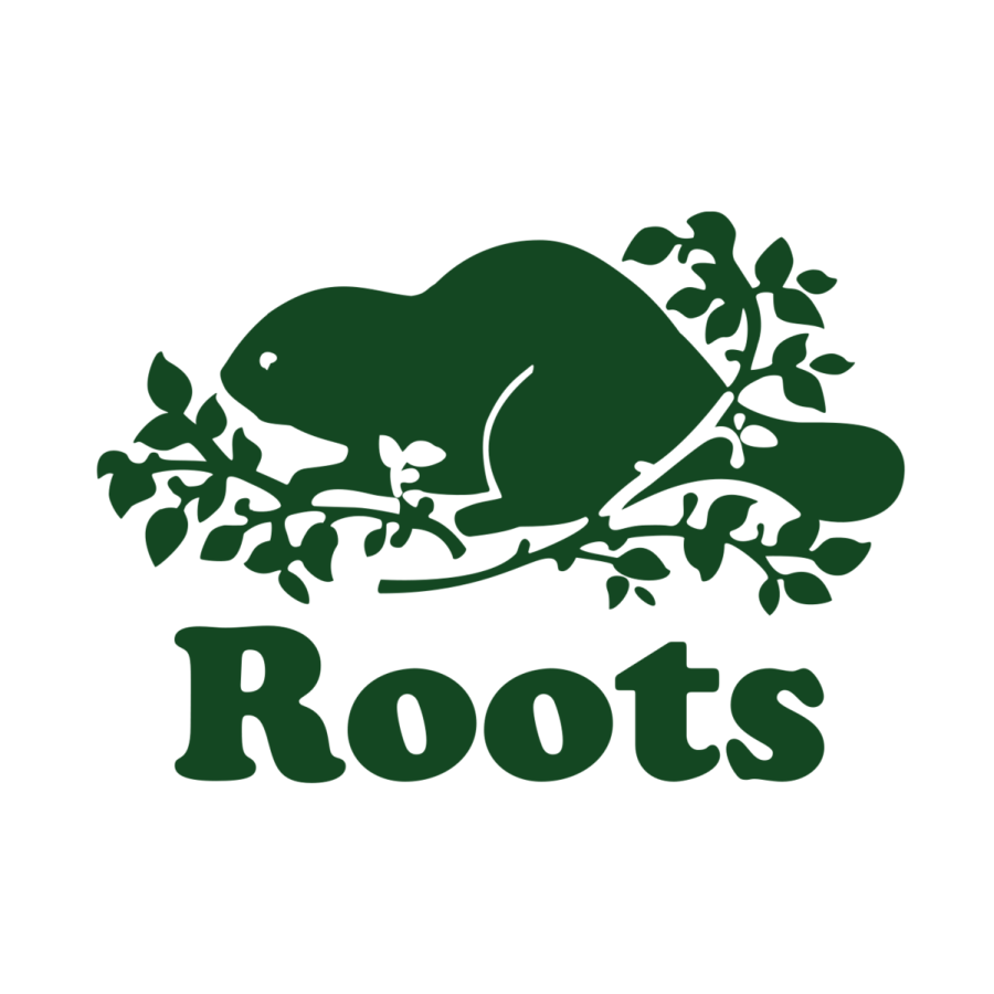
Can a brand get any more Canadian than Roots? Inspired by Canada’s wilderness, every product somehow feels like a reflection of the true north — wild, strong and free. And how could it not? Every product is marked with the Canadian beaver found in the Roots logo!
When I was living abroad, seeing the Roots logo on someone would make me feel a little closer to home. To me, it brought back memories of all the things I love about Canada — the diverse landscape, nature and our welcoming culture.
I admire the brand because as other Canadian companies have been selling out or moving to other countries, Roots — for the most part —has managed to stay in Canada. Their headquarters and even a large manufacturing facility are still in Toronto. Roots has shown a strong commitment to our country while promoting a healthy, active lifestyle and respect for our environment.
Tamara

One of my favorite moments growing up was when my father would take me to Canadian Tire. Walking the aisles of their stores is an opportunity to re-live those memories. Each adventure, whether camping or hiking or fishing was always preceded by an excitement-filled trip to Canadian Tire for the appropriate gear. I also distinctly remember choosing my first bike — a yellow Super-Cycle, resplendent with a banana seat.
While it’s the memories in the store that are dearest to me, the brand has had a profound impact in my life. At the forefront of the brand is its triangular logo, whose concept was quickly conceived in the 50’s to mark the front of their oil cans. It has only seen minor updates, and it has now become emblematic of everyday life in Canada. It symbolizes our love of home, automobiles, sports and leisure and outdoor pursuits.
Nick

There are a lot of great Canadian logos. Some because they are sweetly simple or have a clever hook, others because of the great companies that they represent. My favourite is the Hockey Canada logo because of the memories it carries.
From drawing it on a t-shirt so I could pretend to be The Great One while playing street hockey, wearing it on the back of house league jerseys growing up or watching it fly at the World Juniors and Olympics, this logo has been around during some of my favourite hockey moments both as a kid and an adult.
From a design perspective, it may not be perfect but the Hockey Canada logo represents all levels of the great Canadian pastime. What can be more iconic than a hockey logo in Canada?
For my fellow fans, check out 100 years of Hockey Canada jerseys here.
Jeremy

One of my earliest memories of an identity is the Royal Canadian Air Force (RCAF). It engaged an aesthetic and fascination with flight in a way that was entirely new to me. The first time I ever saw the roundel was on a flag — which flew proudly over my Grandfather’s farm, right on the coast of Lake Ontario. As someone who had served with the RCAF, my grandfather saw part of his identity in the iconic logo.
The blue and red roundel has its origins in the Royal Canadian Corps (1914). While it has seen many slight variations, the mark we recognize today was designed in 1968, as an evolution of the emblems that had been around since the first world war. It is a bold-stroked circle with a clean red maple leaf inside.
The RCAF logo has become a symbol that is quickly identifiable and emotionally engaging to all Canadians.
Samantha
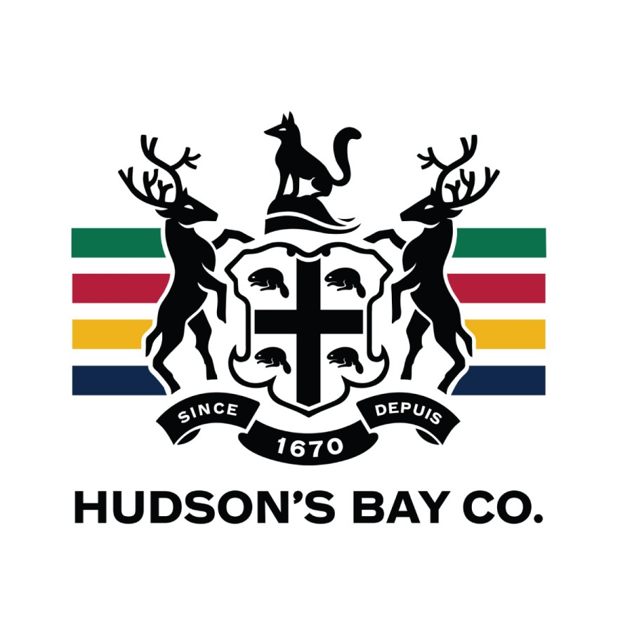
Since its beginnings in 1780 during the Canadian fur trade, few things have been as iconic as the famous Hudson’s Bay stripes. The green, red, yellow and indigo stripes on items from furniture and clothing to spatulas and beer bottle openers feel cozy, vintage and timeless to Canadian consumers.
I mean a scarf is $190 but hey, you’d look super Canadian!
Let’s say one day I am scrolling through my Instagram feed and this picture pops up…
I instantly know that it is Hudson’s Bay. You would too.
That’s what great marketing and branding are all about: making your look unique and so recognizable that people can’t help but think of your brand name when they see your truck and trailer drive by, notice an eye-catching promotional piece when going through the mail or come across your ad when flipping through a magazine.
Such a simple concept can often be difficult in practice. People may think that you have to plaster a huge logo over everything so people will notice your brand. However, we can learn a lesson from Hudson’s Bay – strong and consistent branding pays off.
Now if I could only get my hands on one of those blankets!
Jason

One of my favourite Canadian icons/graphic identities is the Canadian National Railway (CN) logo designed by Alan Flemming.
This logo exemplifies the famous saying; “Everything Should Be Made as Simple as Possible, But Not Simpler.”
The CN logo is a simple, bold and fluid mark exuding confidence, movement, clarity, and timelessness. It’s as iconically Canadian as the railway itself.
There’s also a great story behind its creation. Alan Fleming — recognizing the importance of this commission — locked himself in his office for almost a month, working night and day on concepts only to have the final idea pop in his head while he was on a plane heading to the presentation meeting. After sketching the idea on a napkin, Alan took a cab to an art supply store, rushed to his hotel room and drafted the final concept. It was the only concept presented — and it was approved.
July 1, 2017