Industry Insights
Compass Clients Win Big at Landscape Awards Ceremony
The landscaping industry’s annual gathering in Southern Ontario, called LO Congress, celebrated it’s 40th anniversary earlier this year and we were fortunate enough to attend the festivities. The highlight of LO Congress 2013 was, for us, the Awards of Excellence ceremony where our clients took home a majority of the hardware including the Dunnington Grubb! Many of the award submissions included photography by Compass Creative’s staff shooter Joel Reynolds. We were also honoured that 6 of the 7 awards for company websites were awarded to Compass Creative Clients. See the winning sites below.
CEDAR SPRINGS cedarsprings.net
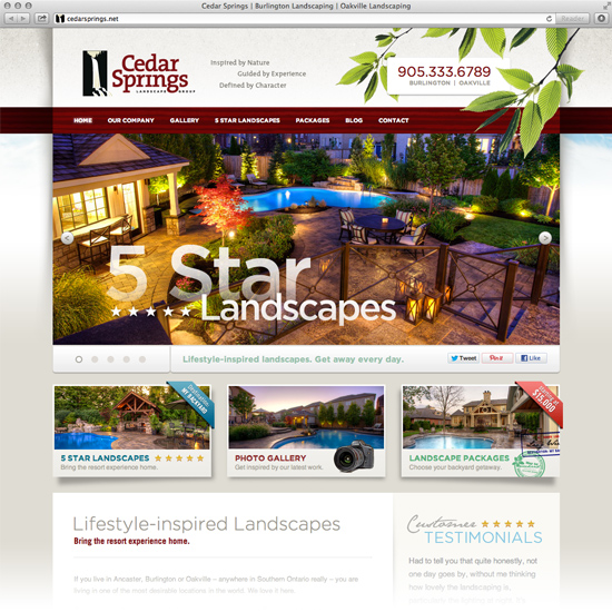
Cedar Springs Landscape takes pride in creating beautiful, lifestyle-inspired landscapes for their clients. They state on their new website that “perhaps the most breathtaking sites the Golden Horseshoe has to offer are in their clients’ own backyards.” They promise creativity, and craftsmanship. So it only made sense that Cedar Spring’s presence online (where more and more people are turning these days to source home improvement services) was beautiful, well designed and reflected their passion and creativity.
The site is designed around the theme of “5-Star Backyards” which is meant to inspire homeowners to re-think their property use and to re-imagine their backyard as a getaway destination. Get away. Every day. This concept is supported by clever messaging, lots of useful content and gorgeous portfolio imagery. It all comes together to give visitors an idyllic, lush resort-type experience on the site, while providing very real examples of Cedar Springs’ work and helpful information about the process. Visitors are encouraged to 1. read more, 2. share the site and/or its content with others, and 3. choose Cedar Springs for a project of their own.

SOME OF THE FEATURES OF THIS SITE:
Content
- A creative theme that resonates with today’s stressed homeowner
- Clever messaging to rapidly build a connection with the audience
- Meaningful content to build trust with readers
- Helpful information to educate potential customers about the process
- Beautiful design to give visitors a great experience
- Sumptuous photo assets to show capability and inspire homeowners
- Blog
Functionality
- Searchable gallery
- Social media integration to aid visitors in sharing the content with their friends
- “Backyard weather” widget
- Contact forms
- Content Management System
Numbers
- 19,176 visitors in the last 6 months, for a total of 74,180 page views
- Very high search engine rankings for targeted key phrases
- Low visitor bounce rate of just 36.00%
The success of the new website has been clear. Awareness of the Cedar Springs brand is up. Traffic to cedarsprings.net has increased. The site delivers a steady stream of qualified leads.
EDENGROVE edengrove.ca
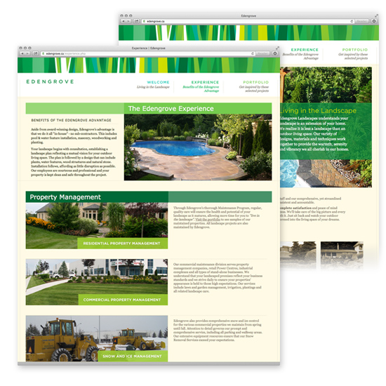
Not every company is interested in aggressively marketing to generate a ton of leads. Edengrove has long attracted an exclusive audience of highly qualified clientele. Their need for a website is less about generating leads and more about supporting a great referral program. It is designed to deliver a meaningful experience for someone who is already farther along in the sales process.
The new Edengrove website coincided with a re-design of their corporate identity. A fresh, new, contemporary identity was developed to better reflect Edengrove’s brand and to connect more powerfully with their target audiences. This website is Edengrove’s first – a somewhat reluctant first at that. Their late arrival to the Internet is proof that you don’t always have to do what everyone else is doing. However it’s also indicative that no one can ignore the Internet any longer.
The Edengrove site is well thought out, beautifully designed, and simple to navigate. It offers up information about the company and lots of well-crafted images of their work in an inviting environment. No hype. No pressure. No ballyhoo. With sophisticated minimalism, Edengrove simply shares their work and lets it sell itself.
Key features
- Beautiful design and easy site navigation
- Simple, short domain name: edengrove.ca
- Semi-responsive design allows website to expand to larger screens
- Substantial image gallery of Edengrove work using high calibre photography
VAUGHAN vaughanlandscaping.ca
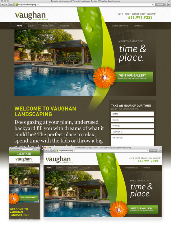
Google warns that 6 out of 10 mobile visitors will leave your website if it is not mobile friendly. Combine that with the numbers on the increasing use of mobile devices for web browsing (mobile said to surpass desktop usage by 2014), and you have a very compelling case for a mobile-friendly website.
Vaughan landscaping has undergone big changes recently, choosing to update their identity, refine their brand and develop their online presence in a short span of time. A more clearly articulated brand promise, a fresh new look and a strong portfolio now come together in a responsive site that looks great no matter what device is being used to browse it. This truly mobile-friendly website is not just an abridged version of a full site, but uses responsive technology allowing visitors to experience the full content while browsing on their phone.
Key features
- Responsive web design
- Huge photo gallery with stunning photography to inspire visitors
- Carefully constructed, well-written content and messaging
- SEO targeting for Vaughan and Toronto areas
- Online contact form
- Backend database tracks all contact form leads
- Highly optimized for speed (even with large graphics). A pingdom.com audit grades site performance at 99/100 and ranks it as faster than 93% of all websites tested.
Statistics
In only the first month since vaughanlandscaping.ca launched, there was substantial activity:
- First place ranking for desired key phrase
- A total of 2,956 page views, from 821 visitors in same period(50% of visitors coming directly from search engines)
SHADEMASTER shademaster.net
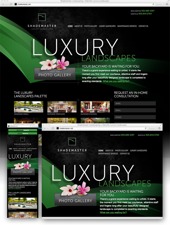
For many years, Shademaster has been recognized in Southern Ontario as a leader in the landscape industry. With numerous awards to show for their work, Shademaster enjoys a solid reputation for their design, construction and maintenance of high-end properties. Their website is a direct reflection of their tagline “Luxury Landscapes.” The stunning design is rich, evocative and luxurious. The site is predominantly black – a colour associated in North America with sophistication, elegance, exclusivity and mystery – making landscape images feel all the more lush.
Shademaster benefits from client referrals for most of their lead generation. The new website supports these referrals by offering a strong “credibility check” to a highly discriminating audience. It also delivers a compelling story to be shared with others. The new site is also designed to attract new leads as well. Compelling content, and a strong call to action are leveraged to attract interested visitors and convert that traffic into incoming leads.
Features and Stats
- Strong, evocative design
- Responsive web design responding to the 25% of users that view the site from a mobile device
- Informative content tailored to specific target audience
- SEO strategy successfully leading an impressive 60% of visitors to the site from search engines
GREEN COLLAR greencollar.ca
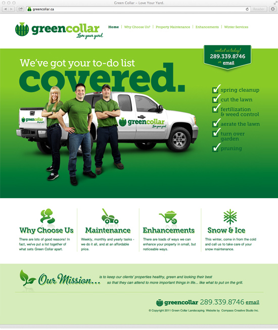
Green Collar’s mission is “to keep our clients’ properties healthy, green and looking their best so that they can attend to more important things in life… like choosing what to put on the grill.” A pretty uncomplicated directive in a world that seems to over-promise a lot.
Green Collar positions itself well apart from the pack by concentrating instead on their core competencies – yard maintenance and great customer service. Their new website reflects this with strategic and creative messaging and lots of useful information. While most landscaping firms rely on portfolio imagery to attract new leads, greencollar.ca connects with language. The site’s content is written in a conversational manner to:
- Fully explain the services they offer
- Perform well in search results on Google
- Reflect the down-to-earth character of the company
Features
- Attractive – Appropriate graphics, tidy layout, and easy navigation give a distinct “feel good” atmosphere.
- Approachable – Straightforward and honest information connects with ideal prospects on both a logical and emotional level. The call to action is clear.
- Authentic – Pictures of the people who actually do the work (not stock imagery) and full descriptions of services – including pricing. Talk about transparency!
Planit Green planitgreen.ca
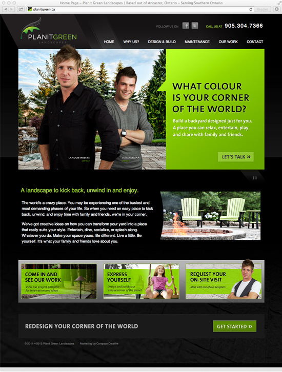
This compact site packs a real punchy look and clever messaging into an online presence that is both refreshing and informative. Planit Green recently underwent a brand makeover including an identity redesign, positioning and marketing messaging. It all comes together here on this site that is easy to navigate and fun to read.
Way to go everyone! We like to think that together we can make both the online world and offline world a better place to be – one “site” at a time.

Written by Jason Bouwman, RGD
February 8, 2013