Industry Insights
Compass Campus: Carol's Typography Day
Typography is an element of design that I’ve always admired, so a recent Compass Campus Day gave me the perfect opportunity to explore a little further into the area. Rather than try to pack a crash course into a single day, I decided to limit my scope to the human side of typography: how people are affected by the use of typefaces. There was a huge amount of very readable, even passionate writings available on the subject, and I thought I’d share a few noteworthy bits for any other typography newbies.
Choosing the right typeface.
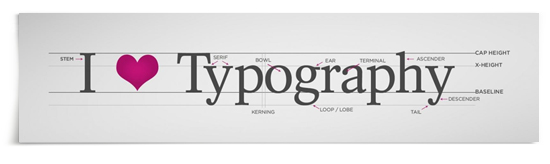
It is said that the mission of a typeface is for “creative non-interference with the message.” It has the delicate task of attracting the reader while not drawing too much attention to itself. If a reader stops to actually consider the type, the type has failed. The type needs to be chosen to function as the silent partner, supporting and elucidating the delivery of the message.
The typographer’s pirouette.
To design a new typeface, the typographer meticulously labours over every angle, corner and curve of every character to create a unified set. But it is the ampersand in the typeface family where the designer often makes an especially expressive flourish. Even in typefaces that are as proper as an old librarian, you often find that the ampersand is the secret alter ego.
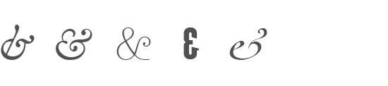
And when you think about it, it’s really a perfect character for the big splash. The ampersand is a special unit in that it’s a single symbol that marries two (or more) elements into one concept. So much more than an “and”, when you use “&” it indicates a whole. Just look at the brands Ben & Jerry’s, Marks & Spencer, Dean & Deluca. That’s a pretty special ability for one character.

The marketing of typefaces
Typefaces work to market their message, essentially, but I found the marketing of the typefaces themselves to be another interesting area.
When ad designers and art directors go to purchase fonts to use in their work (because they are never satisfied with only those provided by Microsoft, or Apple even) they shop at font websites, where they too are marketed to.
Font sites are the one place where the message takes a backseat to the font itself. Here the font is hero. But the font can’t succeed alone — fonts need to be presented as words (not simply a string of letters) because people need to see it “in use” to get a real sense of how well it works.

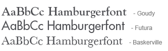
is more useful — and more engaging — than
Today, typefaces are created by the thousands every year. Font vendors need to efficiently differentiate their own by displaying them in shorter bytes, like the standard nonsense words “hamburgerfont” or “handgloves,” or in words appropriate to their character, style and even potential use.
Throughout my day, I was often surprised by how strongly designers feel about their own and others’ typeface choices. And oddly enough, for the abundance of typefaces now available commercially, it is often the most basic in form that are the most hotly debated. Typefaces have a distinct, if mostly subliminal, effect on people, but it’s far from just the end reader that is emotionally affected by their use.

Written by Carol Classen
March 25, 2013